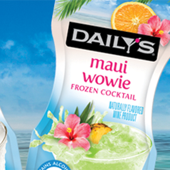
Sun, sand, and Daily’s frozen ready-to-drink cocktails…a mini vacation without the sunburn!
After a review of Daily’s core frozen cocktail offerings, The Biondo Group, along with Harvest Hill Beverage Co., set out to refresh and reposition the complete line to reflect an overall tropical sense of place, while maintaining individualized cocktail colors and...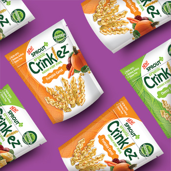
Sprout Organic Foods continues to innovate with launch of Organic Crinklez!
Is your toddler’s ready to explore new tastes and crunchy textures? Whole Foods Market predicted that puffed and popped snacks will be a major trend in the coming year. Sprout Organic Foods is continuing to be on-point with their new toddler introduction – Organic...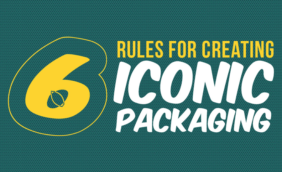
Six Rules for Creating Iconic Packaging
Insights and takeaways from our Founder, Charles Biondo as he discusses six principles remain consistent throughout the decades, through the technological advances that changed the design industry, shifts in consumer preferences and evolutions in brand marketing communications.
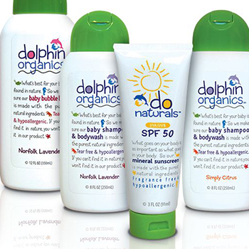
Brand Story for Dolphin Organics and DO Naturals
Our work for Dolphin Organics and DO Naturals line of hair and skincare products was highlighted in Packaging of the World. (you can read the article below) Biondo Designs the Brand Story for Dolphin Organics (DO) and DO Naturals When organic foodies Nigel and Ayo...
Brand Champions: A Retrospective
I started out as a package designer in 1960. Magic Marker was the medium, and beautiful and trustworthy was the message. Looking back on the ‘60s, packaging design was really in the last stages of the post-war boom, when marketing and sales efforts still focused on promoting single lines or individual brands.
Packaging design of the ‘60s was mostly four-color process litho sheets laminated to corrugate. Designs tended to be simple and memorable, like the classic Corning cornflower, which consumers instantly recognized and adored. Coupled with the advanced technology of CorningWare, the “blue cornflower” brand enjoyed unprecedented loyalty and trust, which allowed it to dominate the category in the ‘70s with such leading brand-name products as Corelle, CorningWare and Pyrex, followed by Revere Ware and Visions in the ‘80s.