
What it really takes to walk into one of Texas’s most competitive grocery aisles and actually get noticed.
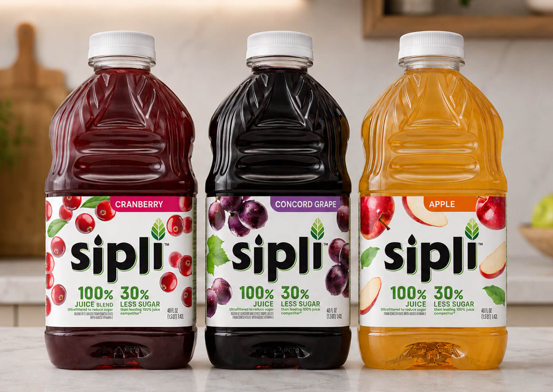
The three seconds are the whole game. That’s how long a shopper’s eyes move across a retail shelf before they stop, or don’t. And for most CPG brands, the packaging is the only player on the field.
When Sipli came to us in early 2025, they had something genuinely special. A low-sugar fruit juice that used a gentle filtration process, similar to drinking water purification, to remove excess sugar while keeping every bit of the authentic fruit taste.
- No artificial sweeteners, flavors, or colors.
- No added sugar.
- 100% Juice, nothing else.
- No shortcuts.
What they didn’t have was a CPG packaging design that could tell that story in a grocery aisle. That’s not a criticism. It’s a gap we see constantly with founders who’ve poured everything into building a better product and then treat the label as a logistics problem to solve at the end. The problem is, at retail, the label is the product. It’s the only salesperson in the room as a shopper moves down the juice aisle, with three seconds to decide.
Sipli’s target retailer was H-E-B. One of the most respected and fiercely competitive grocery chains in Texas. Their competition on that shelf included Welch’s, Mott’s, Ocean Spray, Lakewood, POM, Martinelli’s, and Central Market’s own premium line. The stakes were real, and the window was narrow.
This is the blog of how we built packaging that earned Sipli a place on that shelf and why every decision we made along the way was deliberate.
72% of consumers say packaging design influenced their purchase decision:
No ad, no sales rep, just the label.

How we work
We don’t start with Design. We start with the Shelf.
The most common mistake we see, from first-time founders and seasoned marketing managers alike, is treating packaging as a creative brief. “Here’s the brand, here’s the product, make it look good.” That instinct leads to labels that are aesthetically appealing and commercially invisible.
At Biondo Group, the first question we ask isn’t “what should this look like?” It’s “what does this label need to accomplish, and where does it need to do it?” Those are strategy questions. And they have to be answered before any designer opens a file.
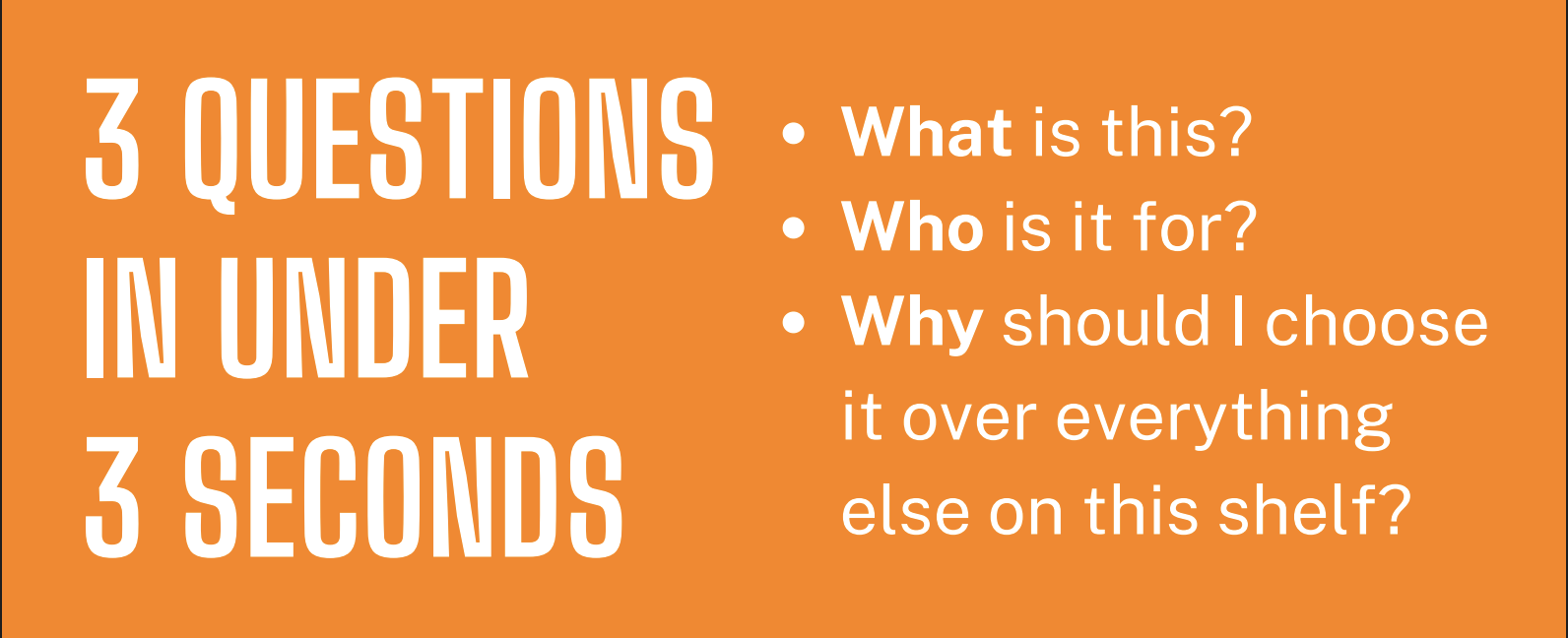
Every successful CPG packaging design project starts with understanding the retail environment, the target consumer, and the product’s unique selling points before creative work begins. Good packaging answers three questions in under three seconds:
- What is this?
- Who is it for?
- Why should I choose it over everything else on this shelf?
Our process starts with a competitive audit, mapping the visual language of the competitive shelf faced at retail. What colors dominate? What typography is overused? Where is there real estate that no one has claimed? The goal is to find the space where a brand can be visually distinct while still fitting the category signals a shopper expects.
From there, we move into consumer and retailer alignment. Who is actually buying this? What signals do they respond to? What does the retailer need from a label to feel confident shelving it?
Only after we’ve answered those questions do we start making creative decisions. That sequence is what separates a packaging strategy from a packaging project.
How Biondo Group approaches every engagement
Biondo Group brings competitive research, consumer insight, production expertise, and creative execution under one roof, so the strategy and the design are never working against each other. For CPG startups entering retail for the first time, that integration is often the difference between a successful launch and an expensive lesson.
The Sipli engagement
A better product deserved a better label
What we did, and why?
How Sipli got eyeballs at H-E-B in Texas
- Competitive audit before a single sketch. We mapped the full juice category Sipli would face at H-E-B, color usage, typography, claim placement, and logo treatments across every direct competitor. The finding: mass brands leaned on deep jewel tones and heavy fruit photography; premium naturals used muted palettes and clean type. Between those two visual camps was an unclaimed space. That became our target.
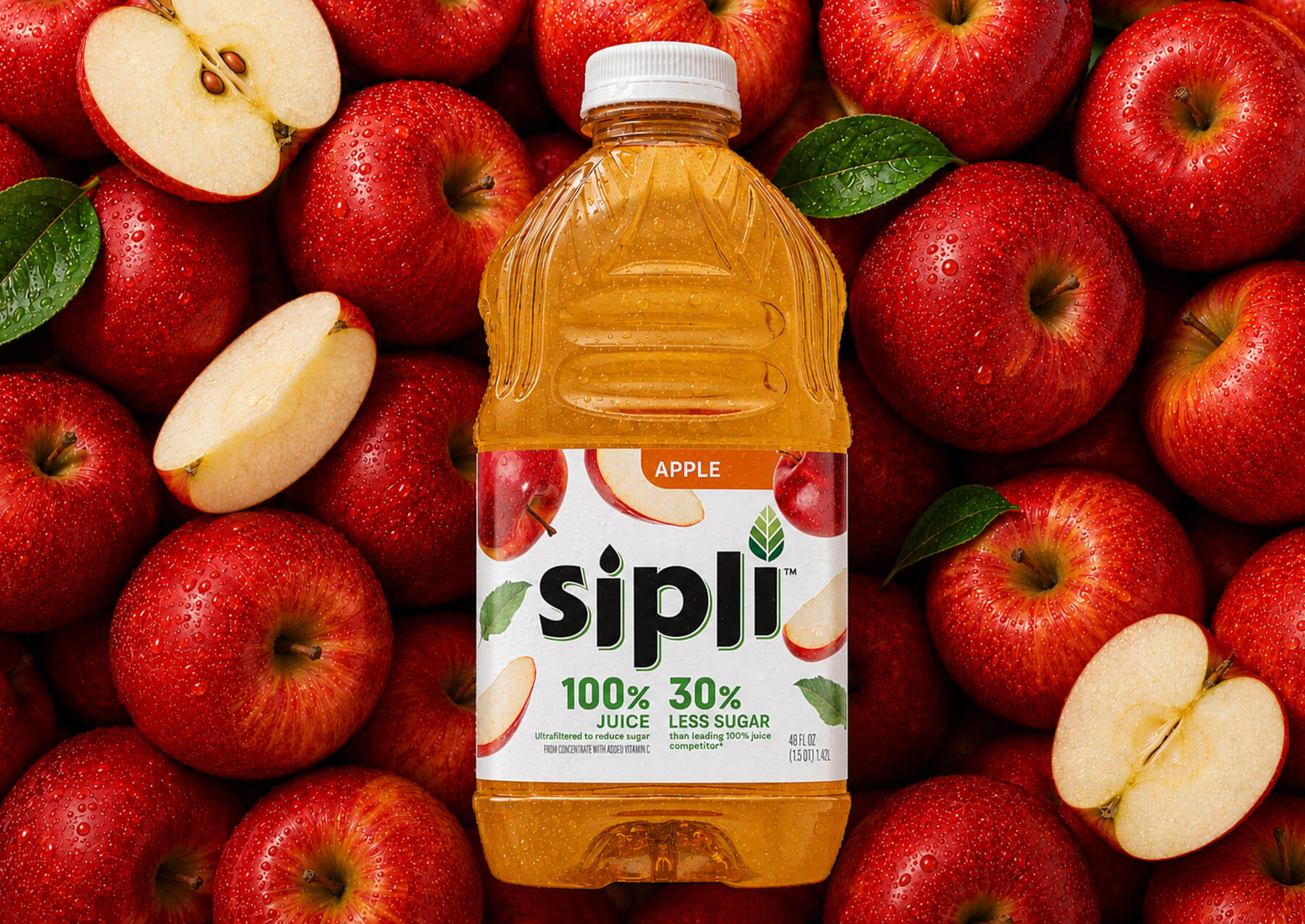
- Eight layout directions, tested honestly. We explored eight distinct layouts for the Apple SKU, different treatments of the logo, hierarchy approaches, and fruit imagery usage. The client gravitated toward the minimalist direction: clean backgrounds, clear claims, a visual personality that felt frank rather than manufactured. That response shaped every decision that followed.
- Positioning research, not guesswork, an independent research group ran parallel consumer positioning testing. We prepared the control images used in that research, production-representative designs, not rough concepts, so the insights were grounded in the actual label rather than a placeholder. Most early-stage brands skip this step. The ones who don’t tend to launch with more confidence, a positive vs negative comment.
- Claims architecture treated as design, not copy. We worked through multiple iterations on how “low sugar,” “no additives,” and “natural process” would live on the label. Violator badges were explored and refined. White backgrounds versus color-coded SKU labels were evaluated. The fruit visuals were progressively simplified to give the benefit copy the front-panel real estate it needed. These are purchase drivers for Sipli’s buyer; they needed to be visible at shelf speed.
- A die line built from the actual bottle. We developed the label die line from the real 48-oz container, not a stock template. When the bottle spec changed mid-process, we adjusted the mechanicals accordingly. This is the kind of production discipline that prevents expensive surprises at print time.
Sipli had a genuinely better product, healthier, lower sugar, no additives. The design job was to make sure the shelf didn’t hide that.
The lessons that transfer
A product with a genuine quality story can be invisible at retail without CPG packaging design that communicates that story at shelf speed. It doesn’t matter that Sipli’s filtration process is genuinely innovative if the label doesn’t surface that innovation at the moment a shopper is deciding.
Claims are not fine print. They’re design elements. The hierarchy of information on your label needs to match the sequence in which a shopper processes it: brand, product type, key differentiator, or you’re losing buyers who won’t work for the information.
The right investment is the one you make before the print run, not the one you make six months after a distribution deal.
When the strategy and the execution align, the label does the selling. The brand doesn’t need a sales rep in the aisle. It doesn’t need an ad that runs during the shopper’s commute. It just needs three seconds and a label that earns them.
You have three seconds on the shelf. That’s the sum of every strategic decision that went into your label, or didn’t.
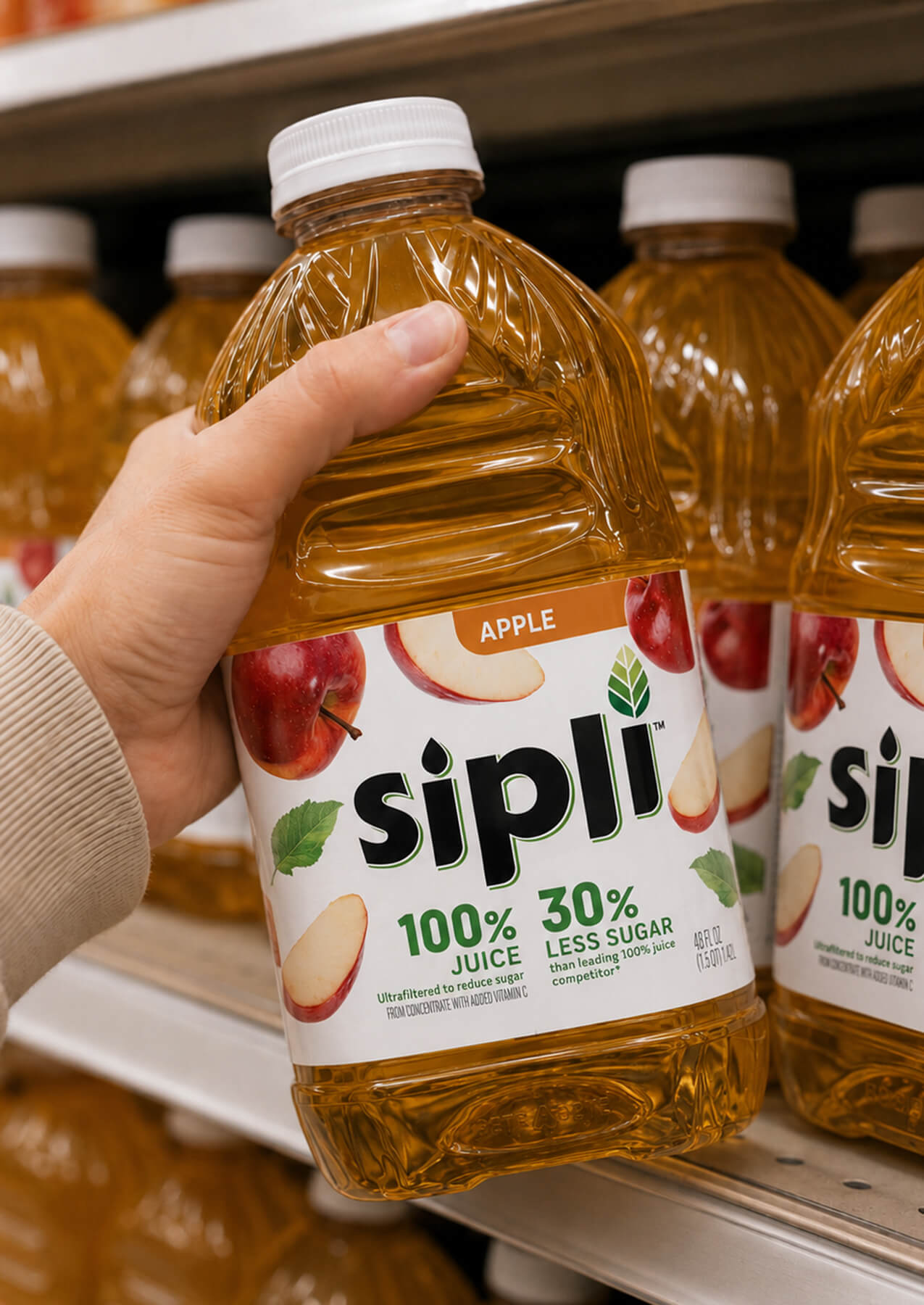
Sipli went into H-E-B with packaging built on a real strategy: a competitive audit, a clear consumer target, deliberate claims architecture, a production-accurate dieline, and a logo strong enough to carry the brand forward. None of that happened by accident. It happened because the design process was treated as a strategic exercise, not a cosmetic one.
If your label isn’t communicating your differentiators, owning a visual identity, and earning attention in those three seconds, it’s time to invest in CPG packaging design built on strategy, not just aesthetics.
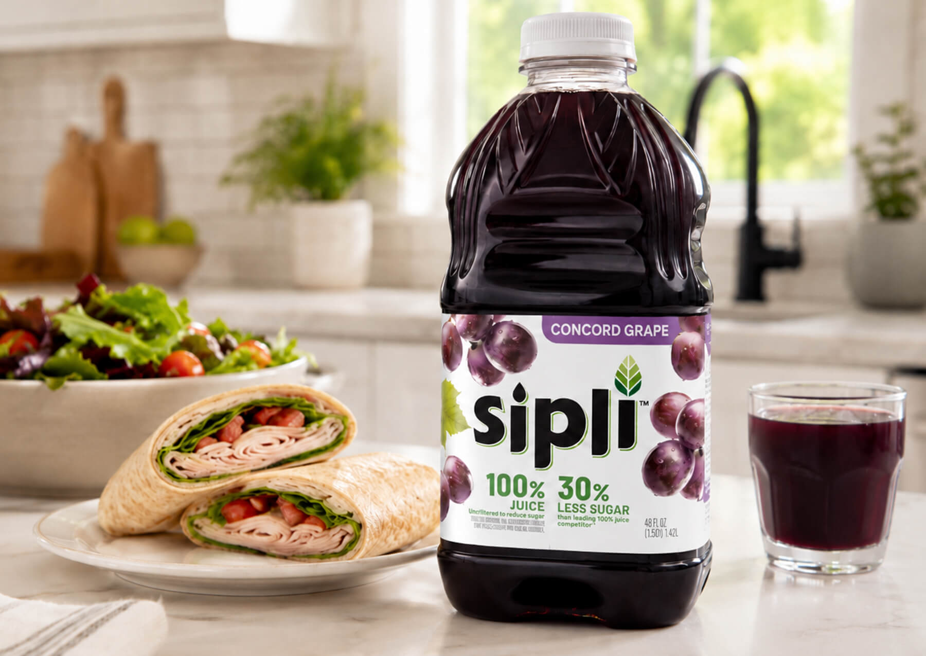
Free Guide: 10 packaging problems CPG brands should avoid
Key takeaways
- The 3-Second Rule: At retail, packaging is your only salesperson; it must immediately answer what the product is, who it’s for, and why to buy it.
- Strategy Over Aesthetics: Successful CPG packaging design requires mapping category visual language, competitive audits, and consumer positioning testing before design begins.
- Claims as Design Elements: Key differentiators (like “low sugar” or “no additives”) must be prioritized in the visual hierarchy so shoppers digest them instantly at shelf speed.
- Seamless Execution: Strategic insight must connect directly to technical execution, from custom die lines to production discipline, to avoid costly launch mistakes.