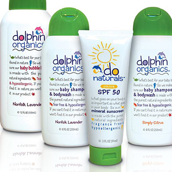


Brand Story for Dolphin Organics and DO Naturals
Our work for Dolphin Organics and DO Naturals line of hair and skincare products was highlighted in Packaging of the World. (you can read the article below) Biondo Designs the Brand Story for Dolphin Organics (DO) and DO Naturals When organic foodies Nigel and Ayo...
Brand Champions: A Retrospective
I started out as a package designer in 1960. Magic Marker was the medium, and beautiful and trustworthy was the message. Looking back on the ‘60s, packaging design was really in the last stages of the post-war boom, when marketing and sales efforts still focused on promoting single lines or individual brands.
Packaging design of the ‘60s was mostly four-color process litho sheets laminated to corrugate. Designs tended to be simple and memorable, like the classic Corning cornflower, which consumers instantly recognized and adored. Coupled with the advanced technology of CorningWare, the “blue cornflower” brand enjoyed unprecedented loyalty and trust, which allowed it to dominate the category in the ‘70s with such leading brand-name products as Corelle, CorningWare and Pyrex, followed by Revere Ware and Visions in the ‘80s.

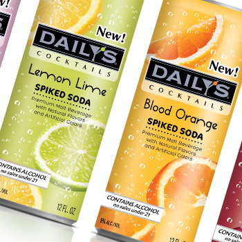
Daily’s Spiked Soda – New Product Launch
Daily’s Spiked Soda is a new brand created for American Beverage Corp. Spiked Sodas! – who’d have thought?!
