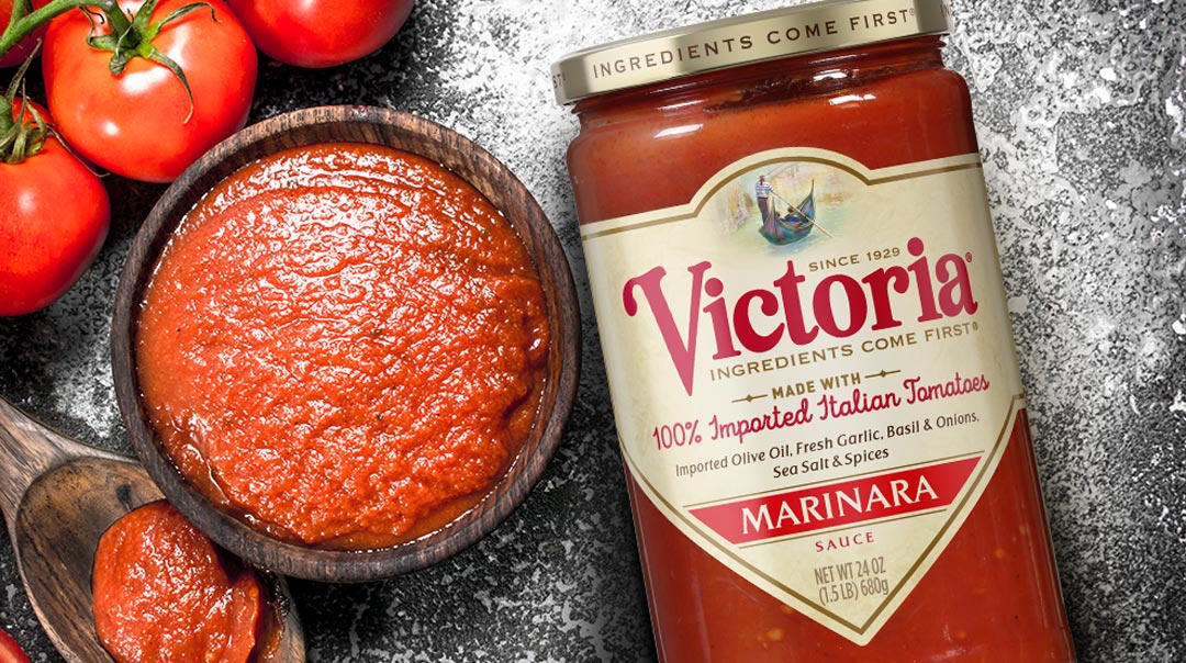
Victoria®’s clean package design emphasizes authenticity and high-quality ingredients.
The Biondo Group modernized this iconic Italian-American brand with a bright, simple architecture that separates the line from competitors on-shelf and online while also expressing Victoria®’s unique story.
In 1929, an immigrant family started selling homemade sauce – made with the finest old-country ingredients – slow-cooked in small batches. The offerings caught on and the delicious recipe never changed.
Winning this year’s GDUSA Award, the package redesign brings focus to the updated logo which is locked into an enhanced and more vibrant rendition of the brand’s ownable “gondola imagery” as well as the promise “Ingredients Come First”; a mantra echoed on the gold cap.
According to Charles Biondo, founder of The Biondo Group, the key creative challenge lay in making Victoria® relevant in today’s environment, while actually enhancing the brand’s tie to its old-world roots and authentic taste.
“We protected the valuable equities in gold, red, and cream, but selected modern hues and graphics – which allowed us to inject life into the Venetian illustration and place greater emphasis on ingredient and flavor call-outs,” said Biondo.
The hierarchy is complimented with a color-coded system that clearly differentiates the 9 flavors and increases shop-ability.
