Packaging Redesign programs are sensitive endeavors on a good day, but on a bad day they can be fraught with tension, as well as “tiger traps” for both the Client as well as Designer. Getting it wrong can be a costly, embarrassing and wholly avoidable mistake.
Sensitivity to packaging design is very important to the success of a program. There is a sensitivity and subtlety that is required to be successful, and its why the best packaging design firms have an ultra-narrow focus and are deep divers. When other creative service companies, such as ad agencies get involved in packaging design programs, they often go awry – an example of that is Tropicana.
In our experience packaging design programs are initiated due to the fact that Brand or Product Management has identified that change is needed. That change can range from radical to incremental and its important to have figured out the right graphic strategy before launching into design.
What we refer to as a Refresh is probably one of the most challenging redesign strategies, because as our leader Charlie says, its “design without change”. Refresh’s are generally very strategic, and nuance is the order of the day.
- Typically, the mitigating circumstances driving a redesign:
- Brand or product has gotten a little musty from a graphic standpoint
- Competitive pressures – new entrants to the category
- Growth in varieties, or addition of new segments, requiring a packaging graphic system that’s able to grow with the product line
- Expansion of the Brand offering, requiring a new graphic strategy that accommodates “going wide”
- Inconsistencies in brand and packaging graphic presentations globally
- Changing shopper behavior
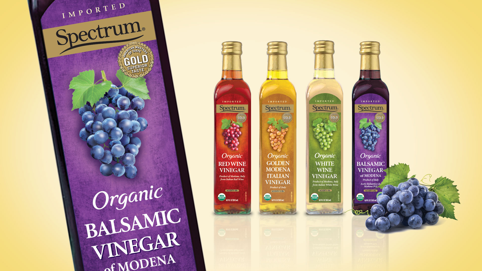
Spectrum Essentials® Vinegars
The Biondo Group works extensively within the Spectrum Brand and has redesigned packaging graphic systems, as well as graphically repositioned select product lines. In this instance we worked with the Essentials® Vinegars product line.
Our design objectives were to:
- Contemporize the look and feel of the packaging graphics
- Communicate a superior quality of ingredients
- Clearly differentiate the varieties
- Simplify the architecture of the primary display panel
Our design solution featured:
- Simplified front panel
- Clean and clear architecture
- Ingredient focused photography
- Stronger, more legible typography
- A new, simpler Brand Identity
