Over 200 design firms and creative departments competed in this contest – held by Graphic Design USA Magazine. According to the publication, the annual competition “celebrates the power of effective design to advance the brand promise and forge an emotional link with the buyer at the moment of truth.”

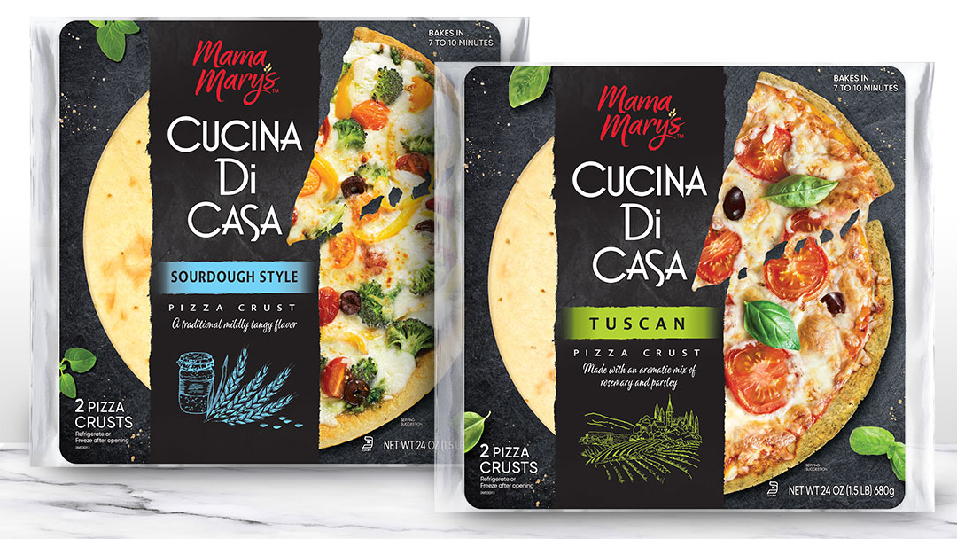
Mama Mary’s Cucina Di Casa – Premium Brand Extension
With the taste for artisanal-style pizza on the rise, B&G Foods launched this specialty line of crusts – which includes three exciting flavors: Tuscan, Sourdough and Ancient Grain.
The Biondo Group was selected to create a modern package design which portrays an authentic image and also conveys the promise of a delicious, home-baked taste experience. It was essential Cucina Di Casa fit within the Mama Mary’s system and yet clearly differentiate – be gourmet.
“Mama Mary’s Cucina Di Casa offerings are the ideal palette for creative, epicurean toppings. We used close-up food photography with warm colors to communicate this RTB and deliver maximum appetite appeal. Ingredient illustrations further enhanced the “small-batch” tone,” said Charles Biondo, CEO & founder.

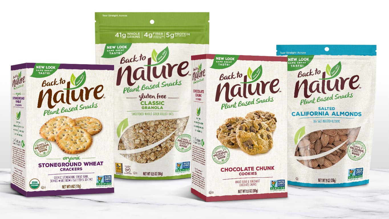
Back to Nature – Brand Refresh
B&G Foods acquired Back to Nature® with a vision of winning over younger Gen-X and Millennial shoppers. The Biondo Group was charged to contemporize this iconic brand’s image with a package design system that conveys the brand’s promise – “Simply Delicious, Simply Good.”
“The Back to Nature® redesign rolled out in late 2019 and we are confident it will be embraced by long time loyalists as well as new shoppers – especially younger families,” said Jordan Greenberg, Executive Vice President & Chief Commercial Officer of B&G Foods.
According to Charles Biondo, the key design challenge was to create a strategic framework that organizes and prioritizes the portfolio – to help consumers understand the total product offering and ease shop-ability. It was important the new look stand out and unify the brand from multiple shelves – cookies, crackers, nuts, trail mix and granola – while also being authentic to its earthy, wholesome roots.
“The Back to Nature story is all about simplicity – so the redesign called for a clean, minimalist approach, which is also most effective for online retail. The eye is pulled first to the fresh, updated logo (the leaf is maintained) and then to delicious-looking food photography, maximizing appetite appeal. Also, a ‘stamp of approval’ was created to showcase the brand’s promise and organize the better-for-you attributes together,” said Biondo.
