Over 200 design firms, creative departments production companies competed in the American Package Design Awards competition – held by Graphic Design USA Magazine. This annual competition “celebrates beauty and style…and the power of deliberate design to forge an emotional link with the buyer at the moment of truth.”

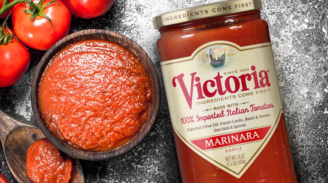
Victoria® – Brand Revitalization and Package Redesign
The Biondo Group modernized this iconic Italian-American brand with a bright, simple architecture that separates Victoria® from competitors on-shelf and online, while fully expressing the brand’s ownable heritage.
The updated logo is locked into an enhanced and more vibrant rendition of brand’s well known “gondola imagery” as well as the promise of “Ingredients Come First”; this mantra is echoed on the gold cap. The hierarchy is complimented with a color-coded system that clearly differentiates the 9 flavors.

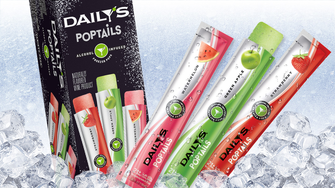
Daily’s® Poptails Launch – Brand Look and Package Design
Harvest Hill team selected the The Biondo Group to create an exuberant brand look & package design for Daily’s® innovative cocktail solution – boozy freezer pops – made just for adults.
Our team’s creative challenge was how to project the offering’s cool, fun personality while also depicting the product’s frosty, chillin’ attributes and grown-up tone.
Brand equity was maintained with the strong black Daily’s® background. Graphic touches of frost and a strong visual of pops sets the brand apart on shelf from the competition. The individual foil wrappers clearly communicate the flavors and mouth-watering goodness of juicy watermelon, luscious strawberries and tangy green apples.
The project includes three individual sleeves, a variety pack carton and a complimentary outer shipper which used white to maximize impact of the variety pack carton at point of sale.
