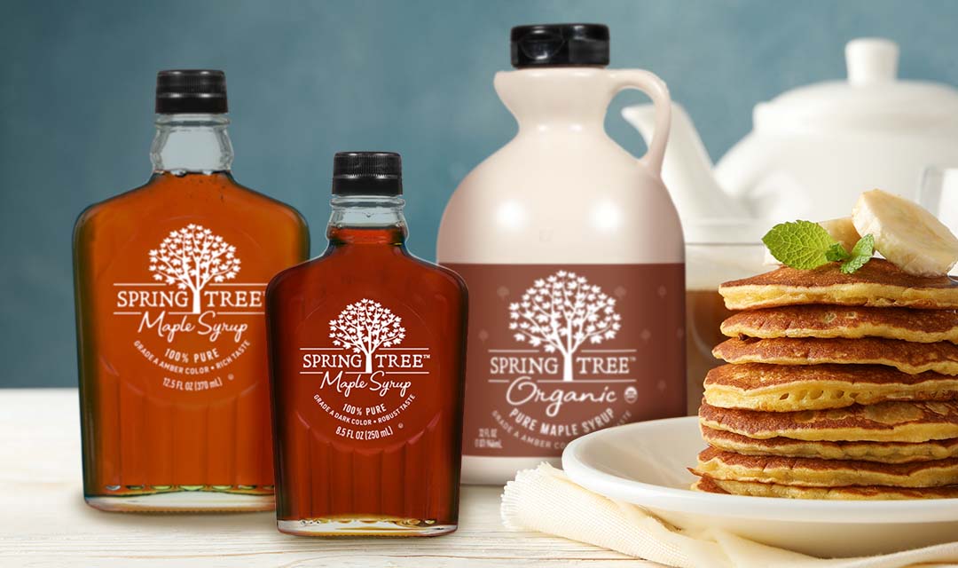
Spring Tree® ‘s new visual image conveys great taste and better-for-you benefits.
Biondo Group partnered with B&G Foods to modernize the Spring Tree® Maple Syrup brand and create a revolutionary look that pops at retail and connects with today’s younger, more health-oriented consumer.
Clean graphics highlight a logo lock-up that incorporates an ownable botanical icon; this device reflects the product’s pure ingredients as well as the company heritage of tapping trees after winter thaw. The simple design allows the amber shades of maple syrup to shine through, promising the shopper a delicious taste experience.
According to firm founder, Charles Biondo the strategic challenge was to determine how far away to move Spring Tree® from its current package architecture.
In an increasingly competitive arena, the Spring Tree® was in danger of losing its #2 leadership position. Through an extensive visual audit, it was determined the current packaging was quite dated. To stand-up to new niche entrants and aggressive private label infringement, the situation called for a bold revamp.
“We started with a bare slate and added only essential elements; the logo type and tree imagery were enhanced. To express a high-quality, pure-ingredient positioning, the color palette was reduced to just white. Flavor differentiation was expressed though the color of syrup” said Biondo.
