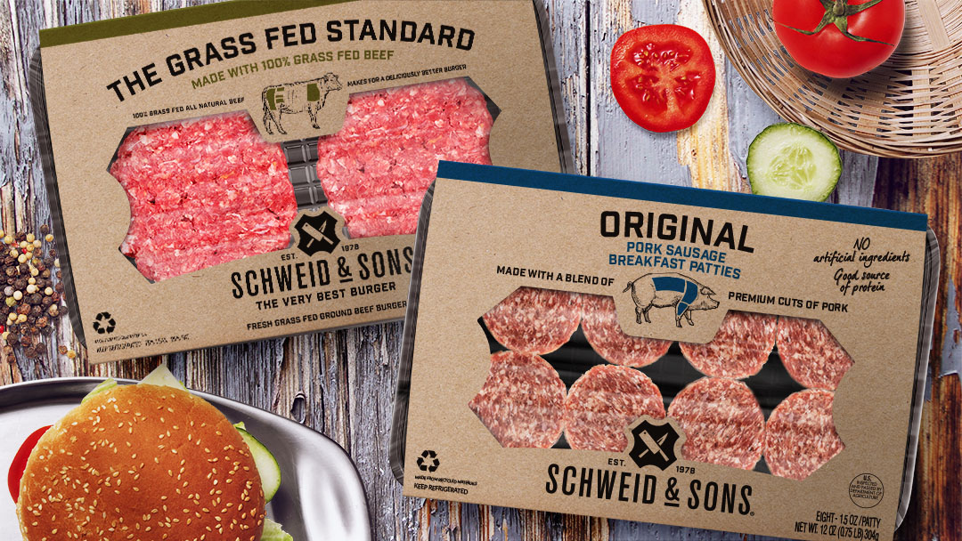
To capitalize upon its growth trajectory, makers of America’s most premium ground beef, Schweid & Sons selected Biondo Group to modernize its visual image and packaging architecture that resonates with today’s sophisticated consumer and increases shopability.
A primary challenge was to create a visual system that organized multiple product varieties and quickly communicated meat cuts, forms, and benefits – even at thumbnail size. The sprawling line includes 19 burger items (in various sizes, blends, and grades) and a new line of breakfast pork sausages, with more line extensions in the pipeline.
Schweid & Sons earned a strong loyalist following by delivering super-premium quality and delicious taste. According to Charles Biondo, CEO and founder of Biondo Group, it was essential to protect recognizable visual elements; the butcher-inspired kraft sleeve and the current brandmark.

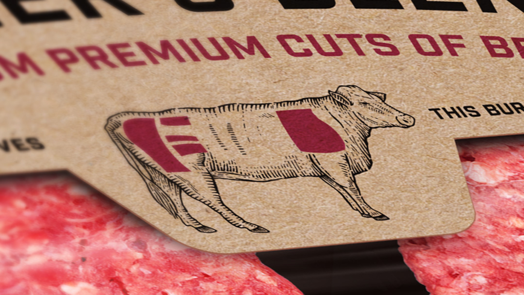
“We took a clean, artisanal creative approach, allowing greater emphasis on brand communication. Prominent brandmark placement with the “Very Best Burger” tag lock-up makes for a bold block at retail. An ownable product window shape inspired by the “shield” in the current brandmark, reinforces the company’s authentic heritage as a 4th generation family-owned meat purveyor. Clear visual cues such as color-coded communication illustrating the protein source (cow or pig), kinds of cuts, and blends – ease shopper identification,” said Biondo.
