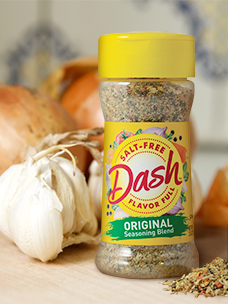
America’s best-known salt-free flavoring brand revamped earlier this year, with a modernized name and “jump-up” look, transforming Mrs. Dash® into a lively Dash™.
To strengthen appeal with new groups such as younger Millennials, while protecting the brand’s deep relationship with older loyalists, The Biondo Group created a visual image depicting a “healthy lifestyle”.
Spicy new packaging rolled-out to stores and online retail just as nation’s shoppers prepared for a long hunker-in-at-home, stocking-up pantries with favorite, trusted-brand staples. With health foremost in mind, consumer’s shift toward “better-for-you” foods is now accelerating. Shoppers actively seek healthy ways to recreate the taste experience and convenience of in-restaurant dining at home.

According to Charles Biondo, founder of The Biondo Group, the key strategic challenge was to create stand-out packaging which effectively communicates this unique brand story immediately across all channels – including at thumbnail size on-line.
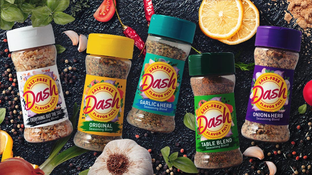
“The evolved Dash™ name allowed for a logo with strong central focus, with historical equities in red and yellow used in a memorable, new way. Ingredient photography surrounds the brand stamp, reinforcing the brand’s all-natural, wholesome attributes. Distinct color coding on labels and caps clearly differentiate flavor and increase shopability,” said Biondo.
The new Dash™ design was used to launch the Everything But The Salt product. The packaging architecture was extended to 26 SKU’s which included 12 base-brand flavors and 2 grilling blend varieties.
