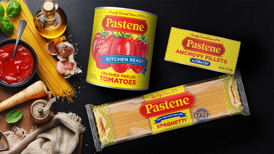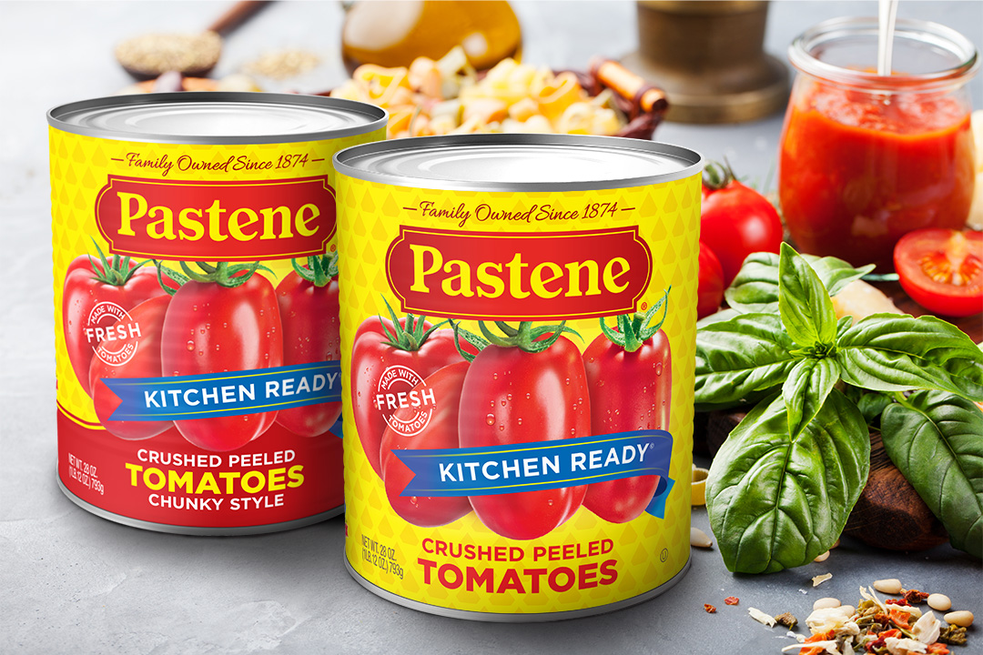
The country’s leading importer of authentic Italian foods, Pastene contemporizes its namesake offering with a clean, crisp brand look. The new packaging system is rolling out to retail in time to mark the company’s 150th anniversary.
A favorite heritage brand in the Northeast and Canada, Pastene is moving beyond its regional, in-store roots and building a strong online presence through the company’s website, Amazon, and Walmart.
According to Charles Biondo, CEO & founder of Biondo Group, this uplift called for a close-in, evolutionary strategy. “Pastene is all about celebrating family meals and traditions. So, it was essential that the new design expressed those values and also remained recognizable to loyalists. Still, a bolder, more relevant image was required to break out online at thumbnail size and connect with today’s younger shoppers,” Biondo said.

The brand’s color equity with red and yellow is a valuable asset and was preserved and enhanced in the redesign. Also, the refreshed logo maintained strong ties to the original, with simplified letter forms and increased color depth. Additionally, the brand lock-up incorporated a new tagline to reinforce Pastene’s long-standing heritage.

Biondo Group created a consistent architecture that could be carried throughout the 150 product offerings, delivering a strong visual billboard at retail. In addition, a graphic language – which included quality photographic compositions – was created to differentiate between offering groups, varieties, and attributes. Importantly, in-store and online shopability was improved for the brand’s signature “Kitchen Ready” tomato products which included Crushed, Whole, No Salt Added, Basil Seasoned, and Organic varieties.
Also, the background imagery separated baseline products from the specialty “Imported from Italy” SKUs. The diamond pattern used on baseline products received a subtle update, while on imported products, the background incorporated an old-world country scene.
