The Biondo Group created brand look & package design system with multi-generational appeal.
To invigorate the company flagship, brand marketing repositioned Ocean Spray Cranberry Sauce into an every-day, multi-occasion condiment – away from being a special-meal only accoutrement. To compete in this new space and visually contend with big spenders like Mott’s, Heinz and Hellman’s – The Biondo Group was chosen to create a break-out package design.
With a 58-year specialty in creating and revitalizing iconic brands, The Biondo Group’s experience includes household names such as Haagen-Dazs, Ronzoni, Jello, Smart-Ones, Planters, Enfamil, Dove and Q-tips.
The team quickly recognized Ocean Spray’s core strategic challenge as one they faced before – how to create a new package design to appeal and pull-in a younger consumer while also protecting recognition and ties with long-time loyalists; this was especially important given aggressive private-label tactics.
Brand Stamina – Multi-generational Connection Through Primal Cues
Charles Biondo, firm founder and ECD shares his philosophy, “Enduring brands – true icons – speak a universal language heard across generations. They call out to consumer’s primal nature, motivating hunter-gatherer impulses toward life-sustaining elements – nourishment, beauty, child nurturing, and tribal connection. A well-designed revitalization protects and enhances this intrinsic connection; it gives the brand stamina to thrive generations ahead.”

For inspiration, The Biondo Group office is filled with pre-Columbian and African art.
Biondo adds that once the essence in place, package design details (fonts, accent colors, graphic touches) may be tweaked to stay contemporary – appealing to specific groups – Boomers, Millennials, Gen Z’s and whoever follows.
Successful Brand Revitalization
With the key challenge(s) and objectives defined, The Biondo Group prefers clean design. “Simplicity is impactful. Strip a brand to its core and focus on essentials. Maybe two or three elements – is all a consumer will take in at the grocery aisle or online – anything more is a distraction”, said Biondo.
The Ocean Spray Cranberry Sauce redesign emphasized these three elements:
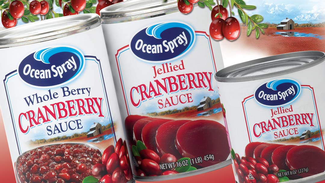
- Logo & Lock-up (Brand Recognition & Presence)
The Ocean Spray known logo was kept prominent with a red & blue frame added to unify the packaging system and increase shelf impact. - Delicious Food Photography (Strong Appetite Appeal)
High-quality, close-in visuals of Ocean Spray Cranberry Sauce and ingredients highlighted the product’s beautiful color and texture. Effective lighting brought the viewer in – almost to the taste experience. - Cranberry Bog Illustration (Ownable Story)
Warm, detailed artwork depicting a New England cranberry blog, captured the brand’s unique heritage – a quality loyalists appreciated.
On a finishing note, if you are considering a package redesign for your own brand and would like a free team consultation, please contact sean@biondogroup.com.
By Jennifer Ludlow, marketing consultant for The Biondo Group.