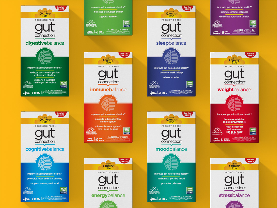
The packaging communicates this new brand’s compelling research-based story as well as its unique benefits. The line consists of 8 varieties, each one offering a separate health solution (i.e. weight management, improved mood and mental clarity).
“We used clean graphics and bold colors to design a powerful brand block on-shelf, while also clearly differentiating products. The design also works in the online shopping environment; we created an infographic icon which quickly communicates the “gut to brain connection” theme – even in thumbnail size. To capitalize on the Country Life® brand equity, we used the recognized yellow logo and ribbon across the SKU’s, further unifying the system,” said Charles Biondo.
“Our packaging truly looks phenomenal and was well-received by anyone who saw it at Expo West. Retailers were very complimentary and have begun to accept the Gut Connection™ product line for their stores. We are thrilled to receive the NEXTY Editor’s Choice Award and believe our packaging was a part of this success story,” Donna Iannucci, Chief Marketing Officer of Country Life®
Congratulations to our talented team and Country Life Vitamins for setting us up for success on this project.