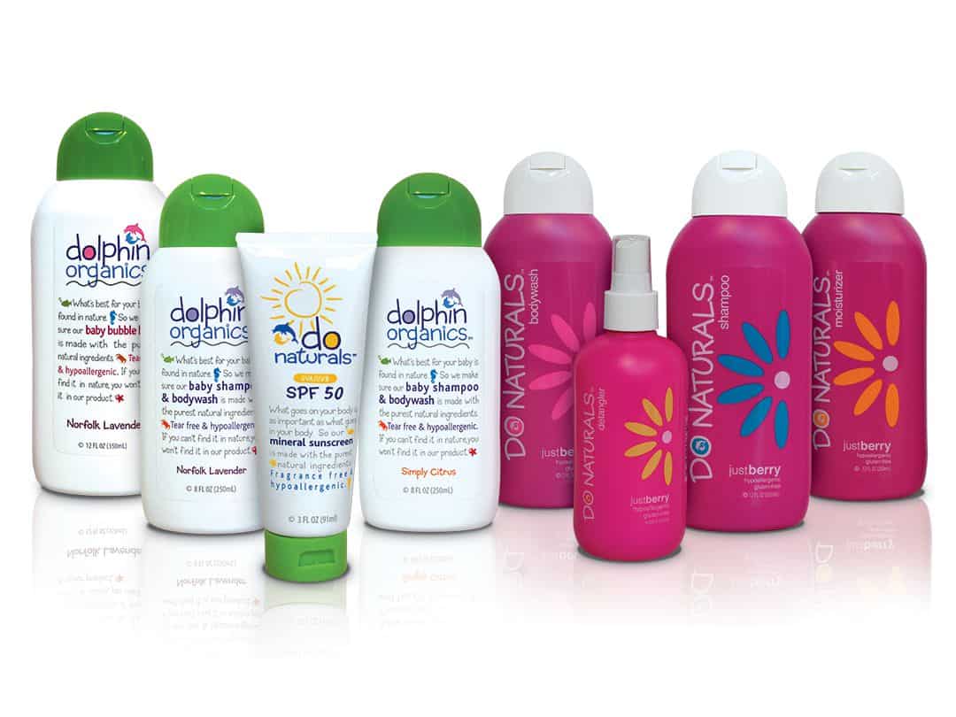
Our work for Dolphin Organics and DO Naturals line of hair and skincare products was highlighted in Packaging of the World.
(you can read the article below)
Biondo Designs the Brand Story for Dolphin Organics (DO) and DO Naturals When organic foodies Nigel and Ayo Hart became frustrated in their search for natural and organic hair and skincare products for their twin baby girls they decided to develop their own brand.
The entrepreneurial couple approached The Biondo Group, Stamford, CT, to create the visual story of Dolphin Organics (Pound Ridge, NY), a line of organic shampoo, bodywash, conditioner, lotion and bubble bath for infants and toddlers, and the brand extension for tweens, DO Naturals. “When we were asked to create the brand identity for Dolphin Organics, we recognized the importance of telling this new brand’s story if we were to persuade mothers who seek only the best for their babies and toddlers,” said Charles Biondo. “Because there is such confusion in the marketplace as to what ingredients are ‘organic’ and ‘natural’ and since Dolphin Organics contains nothing artificial, we decided to tell the story on the packaging itself.”
To convey the purity of Dolphin Organics products, Biondo dressed the line in bright white plastic bottles, each with a vibrant green top, as a reflection of the natural world. “We selected green because it is gender neutral and appeals to toddlers and moms,” said Charles Biondo. “This green looks very fresh, very organic, and fits perfectly with the brand image of Dolphin Organics.”
Next Biondo created a fun and friendly logo – two dolphins playfully positioned above a hand-lettered type treatment of ‘Dolphin Organics’ that floats above a wavy water line. On each bottle, the letter ‘o’ in Dolphin is color coded to match the product: purple for baby shampoo & bodywash, pink for bubble bath, yellow for baby lotion, green for hair conditioner. “We wanted each product to be stimulating, youthful and most importantly to convey ‘fun’,” added Biondo. Biondo used the package front to tell the Dolphin Organics story.
A whimsical icon precedes each product benefit – a fish before “What’s best for your baby is found in nature,” followed by a starfish, a seahorse, and a crab – between statements. The back panel of each Dolphin Organics bottle clearly spells out the product benefits in a chart with three easy-to-read ingredient categories – Organic, Natural and Artificial. The last column ‘Artificial’ is empty. The back also carries the marks of organic certifications, spelling out exactly what this product means for the health conscious consumer. –
See more at: http://www.packagingoftheworld.com/2014/02/dolphin-organics.html#sthash.27PlQsKy.dpuf
