exploring
culinary imagination
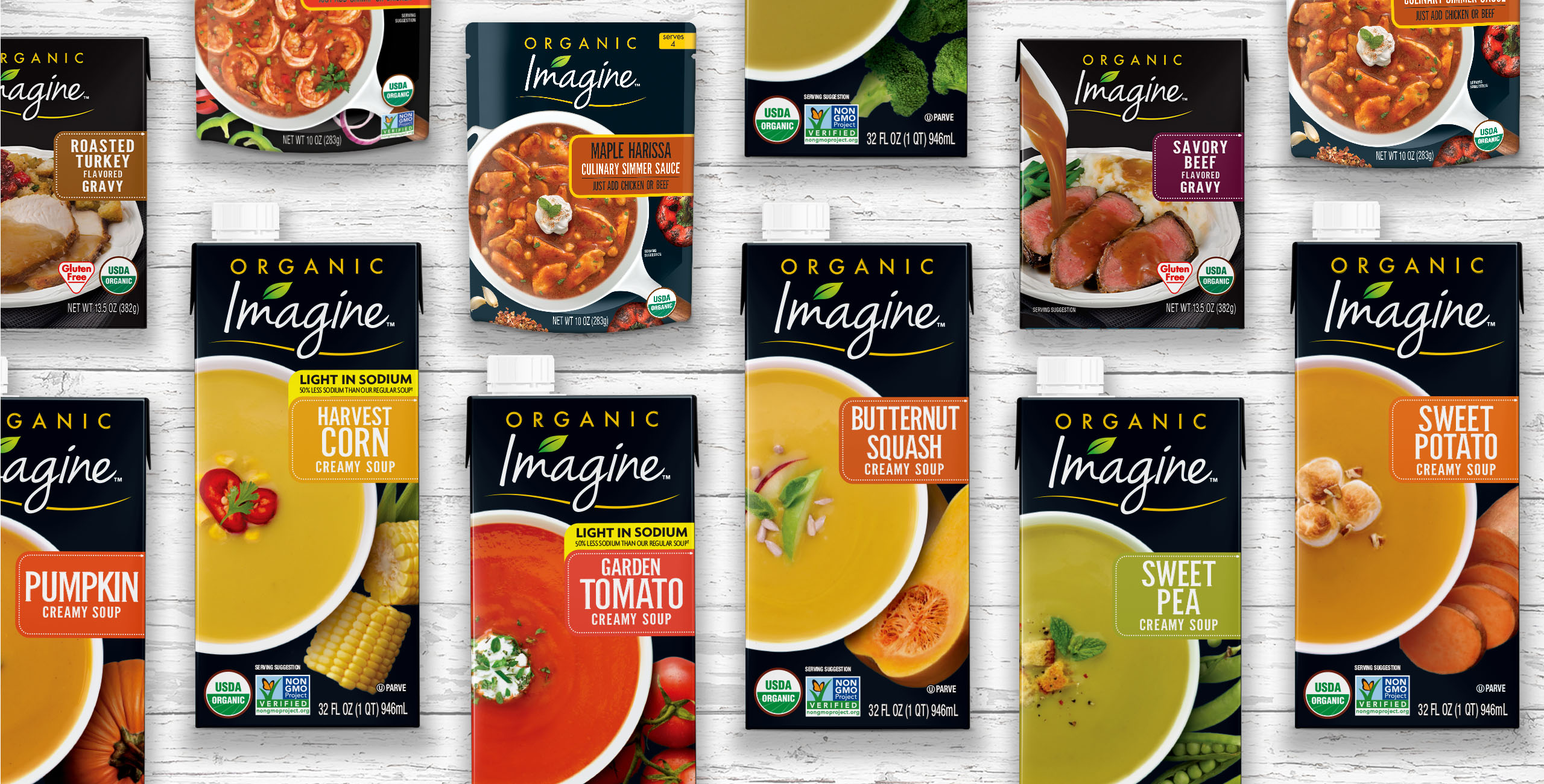
The Imagine brand was faced with a decline in sales due to the crowded shelf-stable soup category. Following research and extensive review of competitive products, the Biondo Group focused on communicating the key consumer expectations for the category – health, taste and simplicity.
Challenging the category norm, we proposed a dynamic black theme, which became the unexpected Imagine brand color. Simple soup visuals with elegant garnishes and farm fresh ingredients elevated the Imagine brand. This unique focal point on shelf visually distances itself from the competitors and engages both the brand loyal consumer as well as a younger, more health conscience audience. We redesigned the logo as a free flowing script, embellished with an abstract leaf accent, which reinforces the contemporary and natural new identity.
SERVICES PROVIDED
package design
brandmark
design refresh
new product launch
line extensions
photography
photo composition/retouching
innovation
production
Client: Hain Celestial

other examples of our work


