heritage
modernized for today
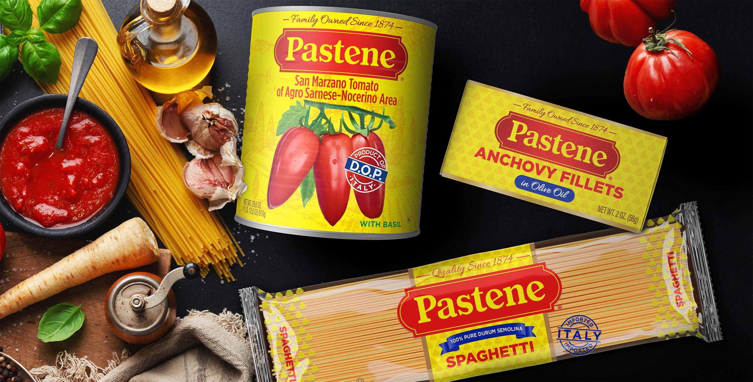
Pastene is all about celebrating family meals and traditions. So, as a heritage brand known for its authentic Italian taste and ingredients, it needed to refresh its packaging to showcase its personality and new premium products.
Since this refresh was driven by a desire to expand Pastene’s retail footprint outside its traditional New England and Eastern Canadian markets, it was essential that the new design express those authentic Italian taste values and remain recognizable to loyalists while connecting with today’s younger consumers with a bolder and more relevant image.
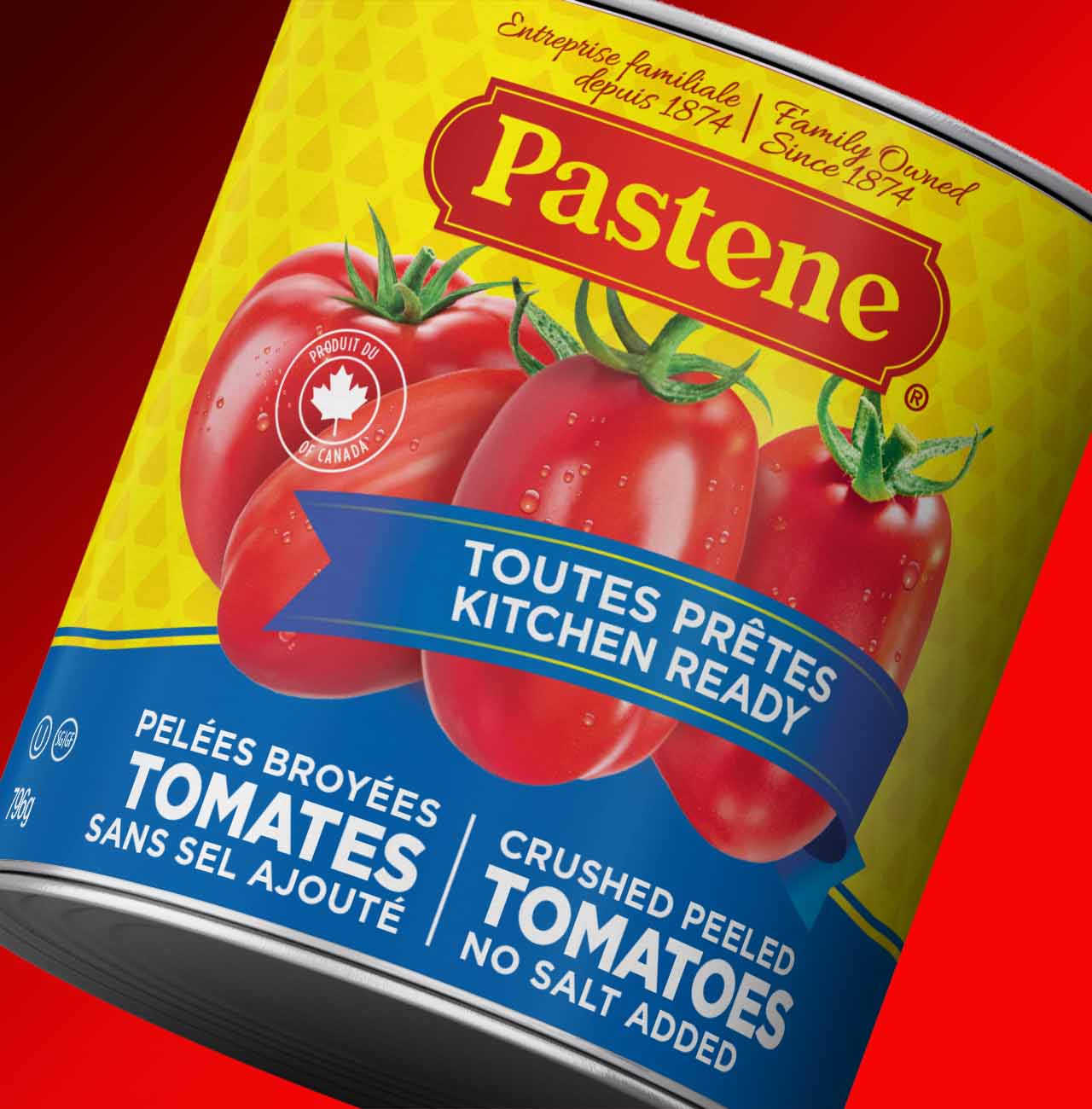
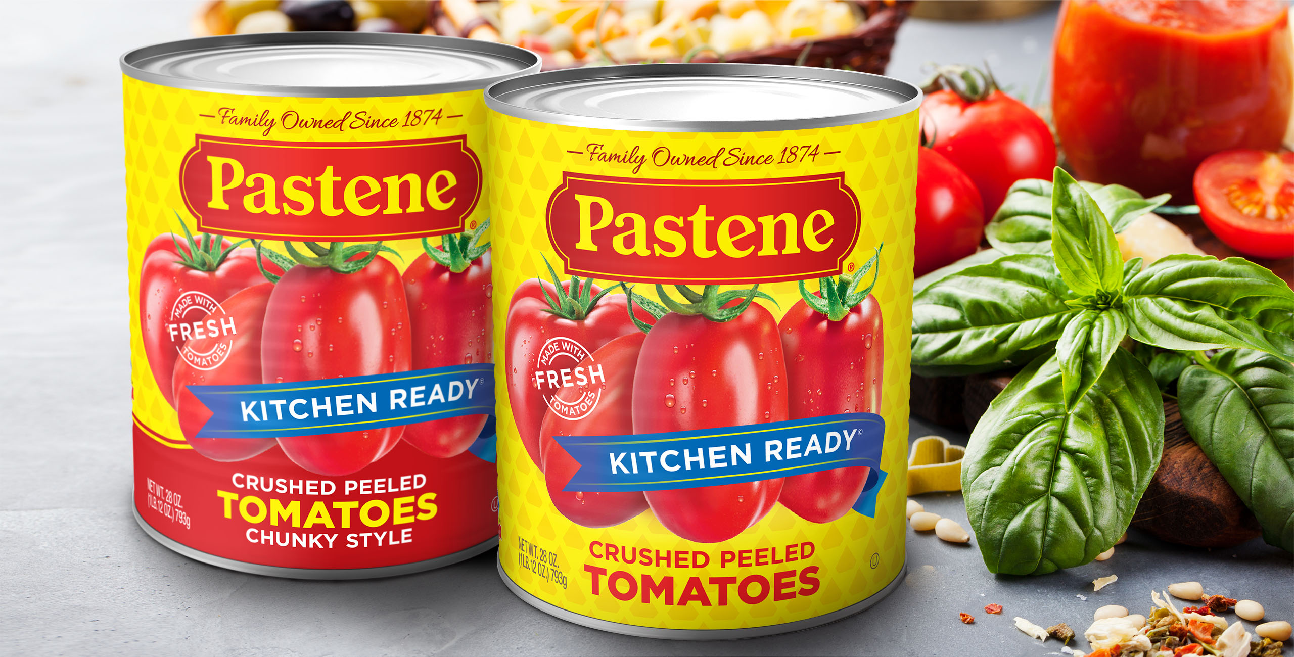
The new design preserved and enhanced the brand’s red and yellow color equity. The refreshed logo maintained strong ties to the original, with simplified letter forms and increased color depth. In addition, the background diamond pattern was updated for baseline products, while a new “old world” country scene separated Pastene’s “Imported from Italy SKUs.”
Working with the Pastene team, we developed a clear and scalable portfolio structure and implemented a design system highlighting the ingredients, revitalizing their brand identity.
This architecture is being carried across the over 150 product offerings in the US and Canada.
SERVICES PROVIDED
package design
brandmark
line extensions
adaptations for Canadian products
photo composition/retouching
production
Client: Pastene