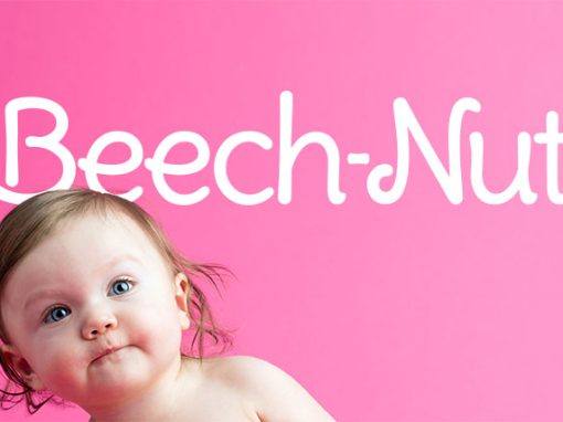
introducing
prebiotics & smoothies for babies and toddlers
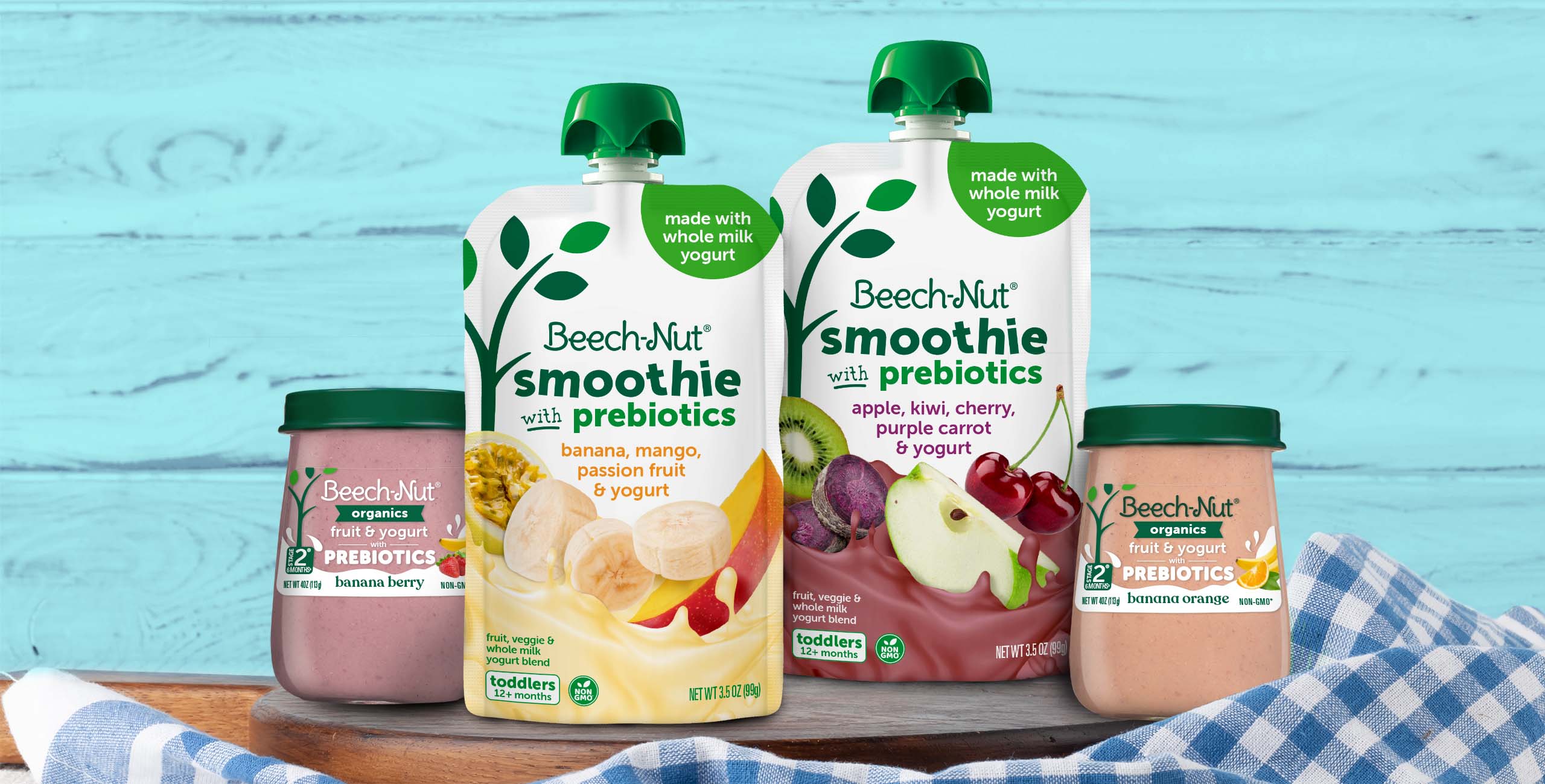
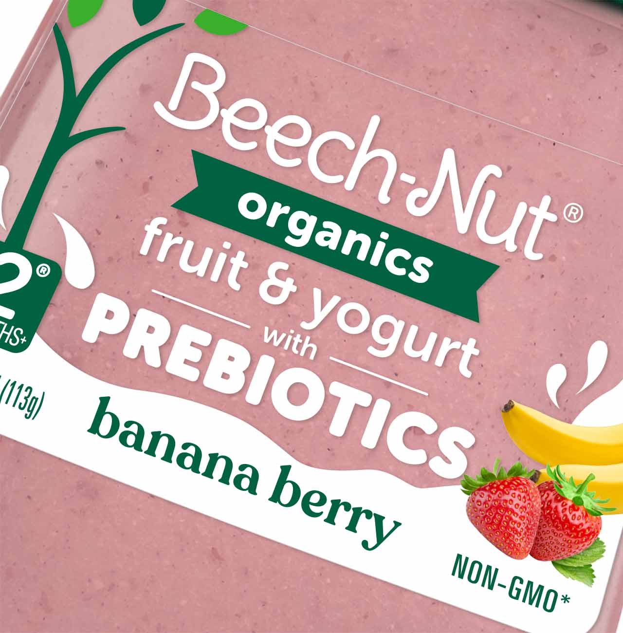
These new offerings needed to stand out within the Beech-Nut®’s mega-sku system.
Our package design succinctly communicates the probiotic attributes both on the shelf and online.
The jars strategically reduced the logo to emphasize the prebiotic attribute, and the “splash” visually expresses the ingredients and health benefits.
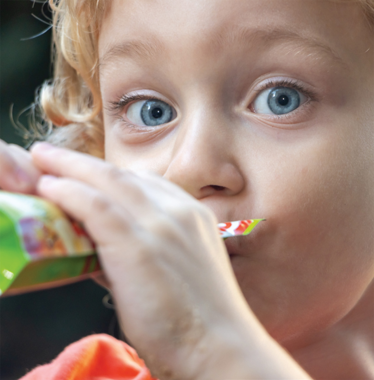
With the Smoothie pouches, we aimed to convey a more playful personality for toddlers. The use of the playful type and smoothie/ingredient photography clearly communicates texture and taste.
SERVICES PROVIDED
package design
brandmark
new product launch
line extensions
adaptations for Canadian products
photography
photo composition/retouching
production
Client: Beech-Nut


other examples of our work