Imagine
The Imagine brand was faced with a decline in sales due to the crowded shelf-stable soup category. Following research and extensive review of competitive products, the Biondo Group focused on communicating the key consumer expectations for the category – health, taste and simplicity.
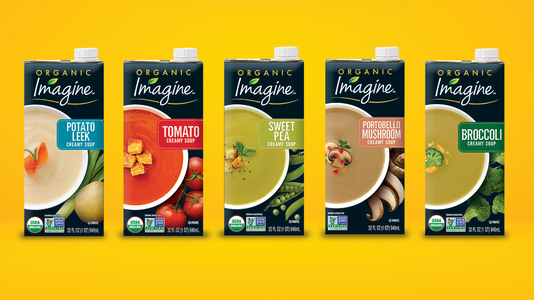
Challenging the category norm, we proposed a dynamic black theme, which became the unexpected Imagine brand color. Simple soup visuals with elegant garnishes and farm fresh ingredients elevated the Imagine brand. This unique focal point on shelf visually distances itself from the competitors and engages both the brand loyal consumer as well as a younger, more health conscience audience. We redesigned the logo as a free flowing script, embellished with an abstract leaf accent, which reinforces the contemporary and natural new identity.
Tone of Voice / Brand Strategy / Design Architecture / Package Design / Brand Identity

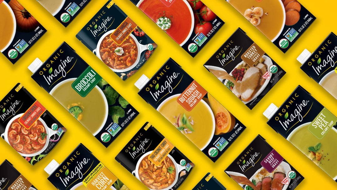
The initial launch of the Imagine Creamy Soup line was so successful, the new brand architecture was incorporated into the Chunky Soup, Gravies and Simmer Sauce product lines. Visuals were changed to reinforce product use and differentiation.
The initial launch of the Imagine Creamy Soup line was so successful, the new brand architecture was incorporated into the Chunky Soup, Gravies and Simmer Sauce product lines. Visuals were changed to reinforce product use and differentiation.

Other examples of our work


