Dash
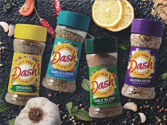
The Biondo Group developed a visual image depicting a “healthy lifestyle” which strengthened brand appeal with Millennials while also protecting the relationship with loyalists. The new strategic framework increases findability and stopping power at shelf.
A bold new logo with a shorter name communicates the brand’s unique promise to quickly elevate consumers’ cooking – in a dash.
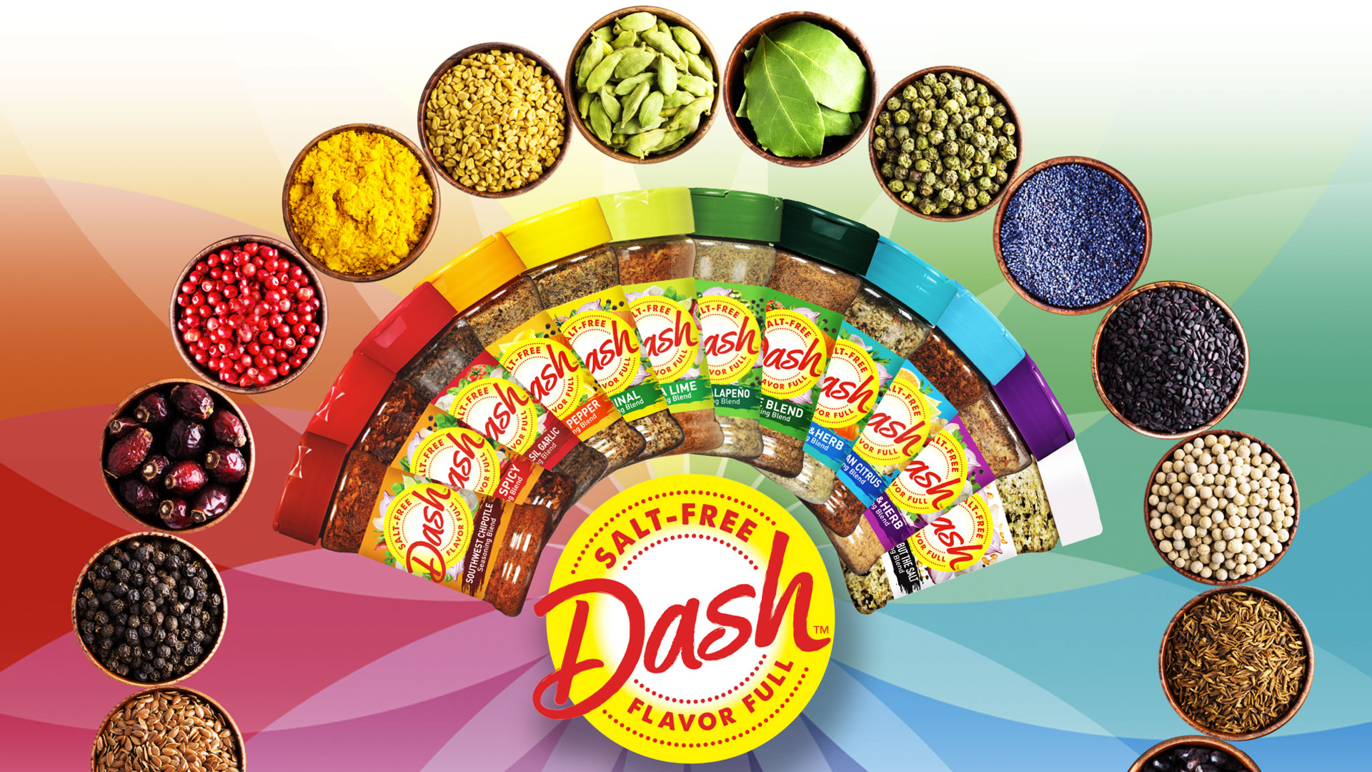
The packaging architecture was extended to 26 SKU’s which included 12 base-brand flavors and 2 grilling blend varieties. Bi-lingual packaging for Canada was also developed.
Brand Identity / Package Design


check other examples of our work


