Package Design Toolbox
Autumn 2019

With just a flicker – in perhaps a garnish, soft glow or highlight around an appetizing product shot – orange will light up a package. Like red, its fiery neighbor on the color wheel – orange calls out on-shelf and stimulates desire – just in a happier, more exuberant way. As a secondary color, orange is a mix of two primaries which also includes optimistic yellow – it represents creativity, friendship, flamboyance and positive change.
“As an artist, true orange is a favorite. It is warm and vibrant – like a hearth it pulls us near. Over 50 years ago, I chose it as the color for my package design firm’s brand identity – it looks just as fresh today. Other elements – lettering, accent colors, logo shape changed – but not Orange Pantone 151 – that’s strong stamina – important for a brand,” said Charles Biondo, ECD & founder of The Biondo Group.
When used strategically, orange is an effective tool to use in achieving various brand objectives.
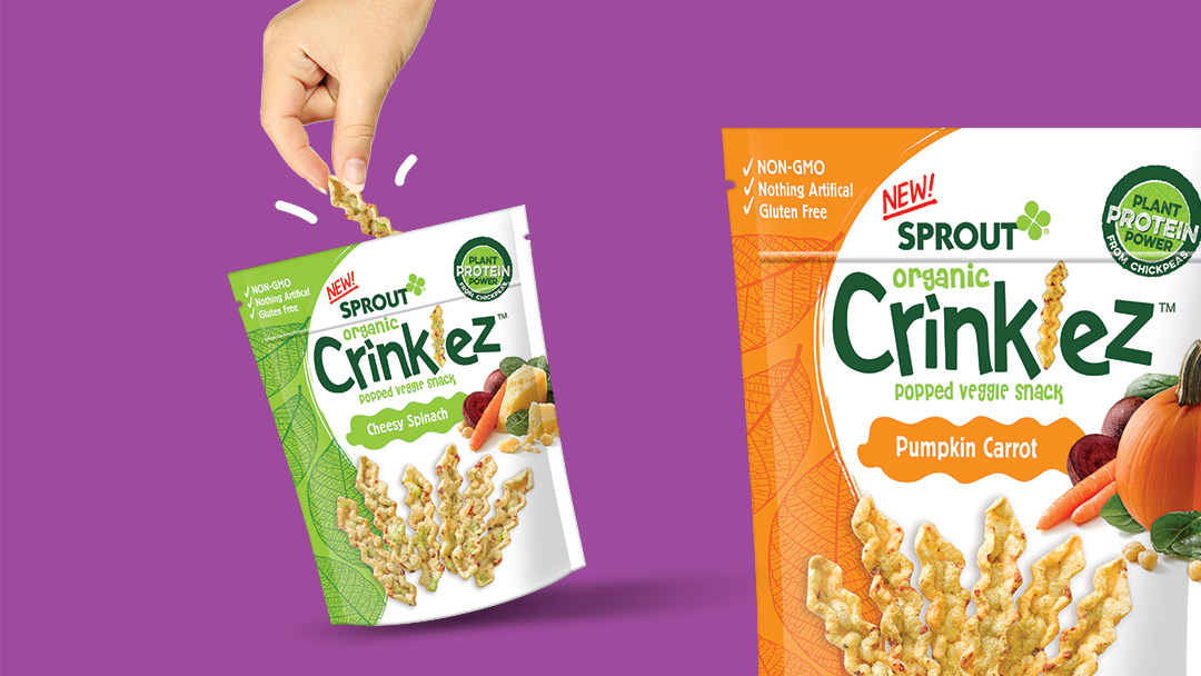
For example, when The Biondo Group created an energetic look for new Sprout Foods Crinklez; a cheery hue was selected to:
- Add sizzle and a playful tone which appeals to both kids & parents
- Differentiate the Pumpkin Carrot offering – which adds support to the brand’s vegetable-based RTB
- Bring shopper’s eye to appetite appealing product shot and vegetable ingredients.
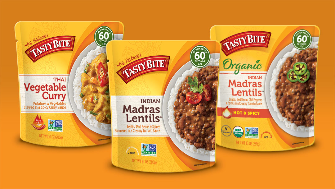
When Biondo and team recently redesigned the Tasty Bite package design system – and extended into new product offerings – the goal was to communicate the brand’s natural attributes and more clearly differentiate offerings. Earthy autumn and terracotta hues were used to separate Rice SKU’s from Entrees and also bring the shoppers eye to the package hero – the delicious food photography; orange also stimulates appetite.
The color family – citrus, pumpkin, salmon, peach is all about flavor. It was named after the orange tree, when the plant was introduced from Asia to Portugal – it comes from the English word “naranja” and the Portuguese one “laranja”. As humans, we are drawn to it at a primal level – seeking vitamin C, B and A and more.
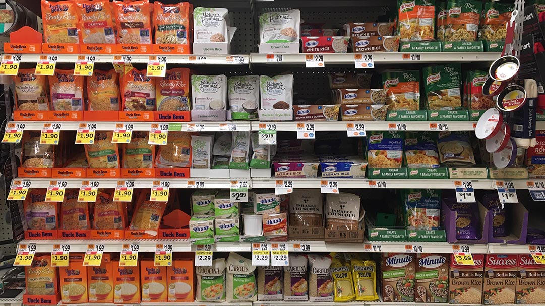
For marketers who are courageous, in most grocery isles orange is underused; red, yellow, blue and green dominate instead. This represents an opportunity to “own orange” – to break-out in a strong brand block. Uncle Ben’s system below is effective.
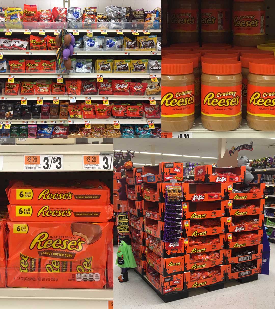
In the same vein, this assertive color calls across multiple environments and different areas grocery store – building a united brand presence. Reese’s is an example; notice how orange is powerful enough to stand-out on the candy, check-out, peanut butter, cereal shelves – a holiday display – and also the freezer case.
“Yet some marketers shy away from it. There is a misperception, it appears cheap and low quality and it will alienate consumers – especially adults. But used well – the right hues combined with unique accents and companions – the effect is exquisite. Just look at Van Gogh’s work,” said Biondo.

“Still Life Basket and Six Oranges” by Vincent van Gogh
On a finishing note, we welcome your thoughts about orange in package design. Is there a way it may help energize your brand? Please send your ideas to Sean@biondogroup.com.
By Jennifer Ludlow, marketing consultant for The Biondo Group.